 е∞Пз±≥жЙЛзїШзљС
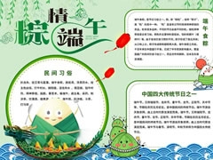
иЛ±жЦЗзЙИзЂѓеНИиКВжЙЛжКДжК•иЃЊиЃ°жЦєж°И
дЄАгАБж†ЗйҐШиЃЊиЃ°
еЬ®жЙЛжКДжК•й°ґйГ®дЄ≠е§ЃпЉМзФ®иЙЇжЬѓе≠ЧдљУдє¶еЖЩ вАЬDragon Boat FestivalвАЭ дљЬдЄЇдЄїж†ЗйҐШпЉМе≠ЧжѓНеПѓиЃЊиЃ°жИРйЊЩиИЯйА†еЮЛпЉМжѓФе¶В вАЬDвАЭ еГПйЊЩе§іпЉМвАЬgвАЭ зЪДе∞ЊйГ®еїґдЉЄжИРйЊЩе∞ЊпЉМеєґзФ®жЈ±иУЭиЙ≤еТМйЗСиЙ≤жР≠йЕНе°ЂеЕЕпЉМжЧҐз™БеЗЇдЄїйҐШпЉМеПИељ∞жШЊиКВжЧ•зЙєиЙ≤гАВеЬ®дЄїж†ЗйҐШдЄЛжЦєжЈїеК†еЙѓж†ЗйҐШ вАЬDiscover the Rich CultureвАЭпЉМе≠ЧдљУз®Не∞ПпЉМйЗЗзФ®зЃАжіБзЪДжЧ†и°ђзЇње≠ЧдљУпЉМдљУзО∞зО∞дї£жДЯгАВ
дЇМгАБеЖЕеЃєжЭњеЭЧ
Festival OriginsпЉЪдљНдЇОжЙЛжКДжК•еЈ¶дЊІдЄКжЦєпЉМзїШеИґдЄАдЄ™з≤ље≠Р嚥зКґзЪДиЊєж°ЖгАВзФ®иЛ±жЦЗиѓ¶зїЖдїЛзїНзЂѓеНИиКВзЪДиµЈжЇРпЉМиЃ≤ињ∞е±ИеОЯзЪДжХЕдЇЛпЉМе¶В вАЬQu Yuan, a patriotic poet lived in the State of Chu during the Warring States period. Devoted to his country but unjustly slandered, he threw himself into the Miluo River. To prevent fish from eating his body, people threw rice dumplings into the river and raced their boats to scare the fish away, which later became the traditions of the Dragon Boat Festival.вАЭ
Traditional CustomsпЉЪеЬ®жЙЛжКДжК•еП≥дЊІдЄКжЦєпЉМиЃЊиЃ°жИРйЊЩиИЯйА†еЮЛзЪДиЊєж°ЖгАВдїЛзїНзЂѓеНИиКВзЪДдЉ†зїЯдє†дњЧпЉМе¶В вАЬDragon Boat Racing: It is one of the most exciting parts of the festival. Teams of people row the dragon-shaped boats in rhythm, trying to reach the finish line first. Making Zongzi: Zongzi are sticky rice dumplings wrapped in bamboo leaves, filled with different ingredients like sweet beans, meat, or egg yolks. Hanging Mugwort and Calamus: People hang mugwort and calamus on their doors, believing these plants can drive away evil spirits and bring good luck.вАЭ
Cultural SignificanceпЉЪеЬ®жЙЛжКДжК•еЈ¶дЊІдЄЛжЦєпЉМдї•дЄ≠еЫљдЉ†зїЯз™Чж£ВдЄЇиЊєж°ЖгАВйШРињ∞зЂѓеНИиКВзЪДжЦЗеМЦжДПдєЙпЉМеЉЇи∞ГеЕґжЙњиљљзЪДзИ±еЫљдЄїдєЙз≤Њз•ЮеТМеѓєдЉ†зїЯжЦЗеМЦзЪДдЉ†жЙњпЉМе¶В вАЬThe Dragon Boat Festival is not only a time for celebration but also a reminder of the importance of patriotism and loyalty. It serves as a cultural bond that connects generations, helping to preserve and pass on traditional Chinese values and customs.вАЭ
Global InfluenceпЉЪеЬ®жЙЛжКДжК•еП≥дЊІдЄЛжЦєпЉМйЗЗзФ®еЬЖ嚥茺ж°ЖгАВдїЛзїНзЂѓеНИиКВеЬ®дЄЦзХМиМГеЫіеЖЕзЪДдЉ†жТ≠еТМељ±еУНпЉМе¶В вАЬWith globalization, the Dragon Boat Festival has gained popularity around the world. Dragon boat races are now held in many countries, attracting people from different cultures to participate and experience the charm of this ancient Chinese festival.вАЭ
дЄЙгАБи£Ей•∞еЕГзі†
жПТзФїеЫЊж°ИпЉЪеЬ®з©ЇзЩље§ДзїШеИґе±ИеОЯзЪДзФїеГПгАБеИТйЊЩиИЯзЪДеЬЇжЩѓгАБз≤ље≠РгАБиЙЊиНЙз≠ЙеЫЊж°ИпЉМиЙ≤ељ©й≤ЬиЙ≥гАВе±ИеОЯзФїеГПдљУзО∞еЕґењІеЫљењІж∞СзЪДз•ЮжАБпЉЫйЊЩиИЯжѓФиµЫзФїйЭҐз™БеЗЇжњАзГИзЂЮдЇЙзЪДж∞ЫеЫіпЉЫз≤ље≠РеТМиЙЊиНЙзЪДзїШеИґи¶БзїЖиЕїйАЉзЬЯпЉМеҐЮеЉЇзФїйЭҐзЪДеРЄеЉХеКЫгАВ
дЄ≠еЫљзїУеТМз••дЇСпЉЪеЬ®жЙЛжКДжК•зЪДеЫЫдЄ™иІТиРљпЉМеИЖеИЂзїШеИґдЄ≠еЫљзїУеТМз••дЇСеЫЊж°ИпЉМдЄ≠еЫљзїУзФ®зЇҐиЙ≤пЉМи±°еЊБеРЙз••е¶ВжДПпЉЫз••дЇСзФ®жЈ°йЗСиЙ≤пЉМиР•йА†еЗЇз••еТМзЪДж∞ЫеЫіпЉМеРМжЧґдљУзО∞дЄ≠еЫљдЉ†зїЯжЦЗеМЦзЙєиЙ≤гАВ
еЫЫгАБиЙ≤ељ©жР≠йЕН
жХідљУйЗЗзФ®зЇҐгАБйїДгАБиУЭгАБзїњдЄЇдЄїиЙ≤и∞ГгАВзЇҐиЙ≤зФ®дЇОз™БеЗЇйЗНи¶БжЦЗе≠ЧеТМдЄ≠еЫљзїУз≠ЙеЕГзі†пЉМеҐЮжЈїиКВжЧ•еЦЬеЇЖж∞ЫеЫіпЉЫйїДиЙ≤еПѓзФ®дЇОж†ЗйҐШеТМз••дЇСпЉМеЄ¶жЭ•жШОдЇЃжЄ©жЪЦзЪДжДЯиІЙпЉЫиУЭиЙ≤зФ®дЇОйЊЩиИЯеТМж≤≥жµБз≠ЙеЫЊж°ИпЉМдљУзО∞ж∞ізЪДзБµеК®пЉЫзїњиЙ≤зФ®дЇОиЙЊиНЙгАБз≤љеПґз≠Йж§НзЙ©еЫЊж°ИпЉМе±ХзО∞зФЯжЬЇжіїеКЫгАВдЄНеРМиЙ≤ељ©зЫЄдЇТжР≠йЕНпЉМдљњжЙЛжКДжК•иІЖиІЙжХИжЮЬдЄ∞еѓМдЄФеНПи∞ГгАВ
дЇФгАБжЦЗе≠ЧжОТзЙИ
жЦЗе≠ЧжОТзЙИи¶БжЄЕжЩ∞жШУиѓїпЉМжѓПдЄ™жЭњеЭЧзЪДж†ЗйҐШзФ®иЊГе§Іе≠ЧеПЈгАБеК†з≤Че≠ЧдљУжШЊз§ЇпЉМе¶В вАЬFestival OriginsвАЭ з≠ЙпЉМдЄОж≠£жЦЗеМЇеИЖеЉАжЭ•гАВж≠£жЦЗжЦЗе≠ЧйЗЗзФ®зїЯдЄАзЪДдЄ≠з≠Йе≠ЧеПЈпЉМи°МйЧіиЈЭиЃЊзљЃеРИзРЖпЉМдњЭиѓБйШЕиѓїжµБзХЕгАВеРМжЧґпЉМж†єжНЃеЫЊж°ИеТМжЦЗе≠ЧеЖЕеЃєпЉМеРИзРЖи∞ГжХіжЦЗе≠ЧдљНзљЃпЉМиЃ©еЫЊжЦЗеЄГе±Аеє≥и°°зЊОиІВгАВ
ињЩдїљиЛ±жЦЗзЙИжЙЛжКДжК•жЦєж°ИиЮНеРИжЦЗеМЦдЄОиґ£еС≥гАВе¶ВжЮЬдљ†еѓєеЖЕеЃєжЭњеЭЧгАБиЙ≤ељ©жИЦи£Ей•∞жЬЙеЕґдїЦжГ≥ж≥ХпЉМ搥ињОйЪПжЧґеТМжИСдЇ§жµБгАВ

иЛ±жЦЗзЙИзЂѓеНИиКВжЙЛжКДжК•йїСзЩљзЇњз®њ

иЛ±жЦЗзЙИзЂѓеНИиКВжЙЛжКДжК•ж®°жЭњжЧ†е≠ЧзЙИ

иЛ±жЦЗзЙИзЂѓеНИиКВжЙЛжКДжК•ж®°жЭњжЬЙе≠ЧзЙИ
жЬ™зїПеЕБиЃЄдЄНеЊЧиљђиљљпЉЪе∞Пз±≥жЙЛзїШзљС » иЛ±жЦЗзЙИзЂѓеНИиКВжЙЛжКДжК•ж®°жЭњ
 жЛЧдєЭиКВжЙЛжКДжК•ж®°жЭњ
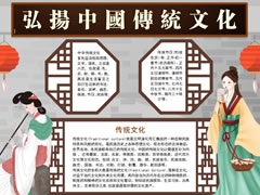 еЉШжЙђдЄ≠еЫљдЉ†зїЯжЦЗеМЦжЙЛжКДжК•еЖЕеЃєж®°жЭњ
 еЉШжЙђж≥ХеЊЛжЙЛжКДжК•ж®°жЭњ
 еЕ≠дЄАеДњзЂ•иКВжЙЛжКДжК•ж®°жЭњ
 дїБдєЙз§ЉжЩЇдњ°жЙЛжКДжК•ж®°жЭњ
 еМЧдЇђеН∞и±°жЙЛжКДжК•ж®°жЭњ
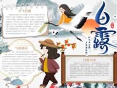 зЩљйЬ≤жЙЛжКДжК•еЖЕеЃєж®°жЭњ
 жИСдїђжШѓењЧжДњиАЕжЙЛжКДжК•ж®°жЭњ
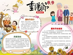 еН°йАЪйЗНйШ≥иКВжЙЛжКДжК•ж®°жЭњ
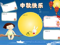 дЄ≠зІЛењЂдєРжЙЛжКДжК•ж®°жЭњжЧ†е≠ЧзЙИ
 еЬ£иѓЮиКВжЙЛжКДжК•ж®°жЭњпЉИзђђдЄЙзЙИпЉЙ
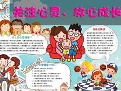 еЕ≥ж≥®ењГзБµжИРйХњжЙЛжКДжК•ж®°жЭњ
 еЕ®еЫљзИ±иА≥жЧ•жЙЛжКДжК•еЖЕеЃєж®°жЭњ
 дєЭдєЭйЗНйШ≥зЩїйЂШз•Из¶ПжЙЛжКДжК•ж®°жЭњ
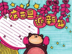 еЕГжЧ¶жЙЛжКДжК•ж®°жЭњ
 ињЗеєіжЙЛжКДжК•жђ£иµП